
PORTFOLIO OF CHRISTOPHER DUFFY AUSTIN

-
Worked with stakeholder to update website's usability
-
Performed usability testing
-
Developed report and prototype explaining changes to stakeholder
MilSpec Medical MacMiller Website
Case Study
I was contacted by representatives of MilSpec Medical about reviewing and suggesting updates for their website. The site is intended to sell the MacMiller S-1 Case, a specialized carrying case for the McGrath laryngoscope, a piece of medical equipment used to insert breathing tubes into patients.
I was presented with the current website and asked to review it to make it more user-friendly and accessible. I took my findings and designed a prototype for a new site, which I presented to the site owners. Links to the old and new websites can be found below, with my in-depth review further below.

GOALS
A.
Review the MilSpec Medical website for the different processes users will visit it for, explain what needs to be changed and why.
B.
Develop a report and prototype that can be used to guide the new developer in updating the website/creating a new one.
CURRENT WEBSITE DESIGN REVIEW
Examining the current website to find its effectiveness.
Below is a review of the MilSpec Medical website as it was initially presented. Beginning with a process map of the old design and pages, moving on to a proposed process map and ending with a written report and prototype.
Communication with the client was done via email.
I presented my findings by using InDesign to lay out a process map for the current website and proposed site update with the different processes that the user would use it to perform.
I presented these process maps along with a written report explaining the shortcomings of the current website and why my updates would improve usability.

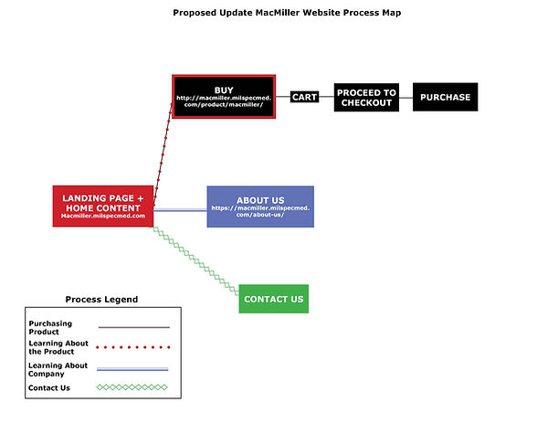
I began by identifying the processes that the user would navigate the MacMiller website to accomplish. In doing so, I also identified the flaws that would impede these processes.
-
Purchase a product: Each page on the website features a link to go to the Buy Page to complete a purchase, and I think should stay the same in the new design.
-
Learn more about product to inform purchasing decision: The product pitch is on the Landing page, as it should be, but the more involved info is on the Home Page. These should not be two different pages.
-
Learn about the company selling the product: Does exactly what the label says it will with very few steps. The page itself could undergo some changes for readability, but the process is fine as it is.
-
Contact the website owners: This does exactly what it needs to do, and I have minor changes to suggest.
Updating Website Pages
How I changed the individual pages to match the new website processes. For these mockups, I didn't make any changes to either the About Us Page or the Contact Us Page, aside from updating both with the same footer with a field for sending messages to the website owner found on the Landing Page.
Landing/Home Page
Combining both the Landing Page (Left) and the Home Page (Right) into the new Landing Page (bottom).


Proposed Website Updates
Taking what I learned from the review to build a more user-friendly website.
After reviewing the old website, I realized that the biggest issue navigating was that the Landing Page (https://macmiller.milspecmed.com/) was different from the Home Page.
This made it difficult for users to find their bearings and know where they were on the site.
The biggest change needed was to combine the Landing and Home Pages. Aside from that, there were some minor changes.
Overall, proposed changes for the established processes:
-
Purchase a product: No change.
-
Learn more about product to inform purchasing decision: Combine the Landing and Home Pages to make navigation easier.
-
Learn about the company selling the product: No changes.
-
Contact the website owners: No changes.
The Landing Page's purpose is to:
-
Quickly entice the user so that they explore the website further
-
Serve as a "starting point" for exploring a website.
The problem with the old MacMiller site was that it had a separate Landing and Home Page, both of which contained info about the website's product.
I streamlined both pages by combining them and narrowing down the most important information for users to first encounter on the site.
For above the fold I included:
-
The video from the old Home Page
-
The buy option
-
A picture of the product.
The content rearranged copy from the old Landing Page with some info taken from the old Home Page. I also added new clipart graphics next to the bulleted list on the right to give more character to the page and help identify what each point covered.

Buy Page
Taking the basic layout of the old Buy Page (Left) and information from the old Home Page to make the new Buy Page (Right).


The old Buy Page had minimal information regarding the MacMiller, and while most users will have made their decision to purchase the product by the time they're on the Buy Page, it would be more accessible for them if any remaining information could be on the page in case they had to look away for any reason.
I took the majority of the copy below the Add to Cart button from the old Home Page. I chose this information because it was more in-depth than the initial pitch material found on the Landing Page.
Prototype
Building a prototype of the new website in Adobe XD for the client to see how their new website will look with my applied suggestions. Below is a gallery of all the pages of the new site.


Using what I took from my review, I built a prototype in Adobe XD that rebuilt the Landing/Home, About Us, Buy, and Contact Us pages in an altered configuration that made it easier for users to navigate the site. I sent this prototype to the client for review and received their approval. They are moving forward with rebuilding their website to my prototype's specification.